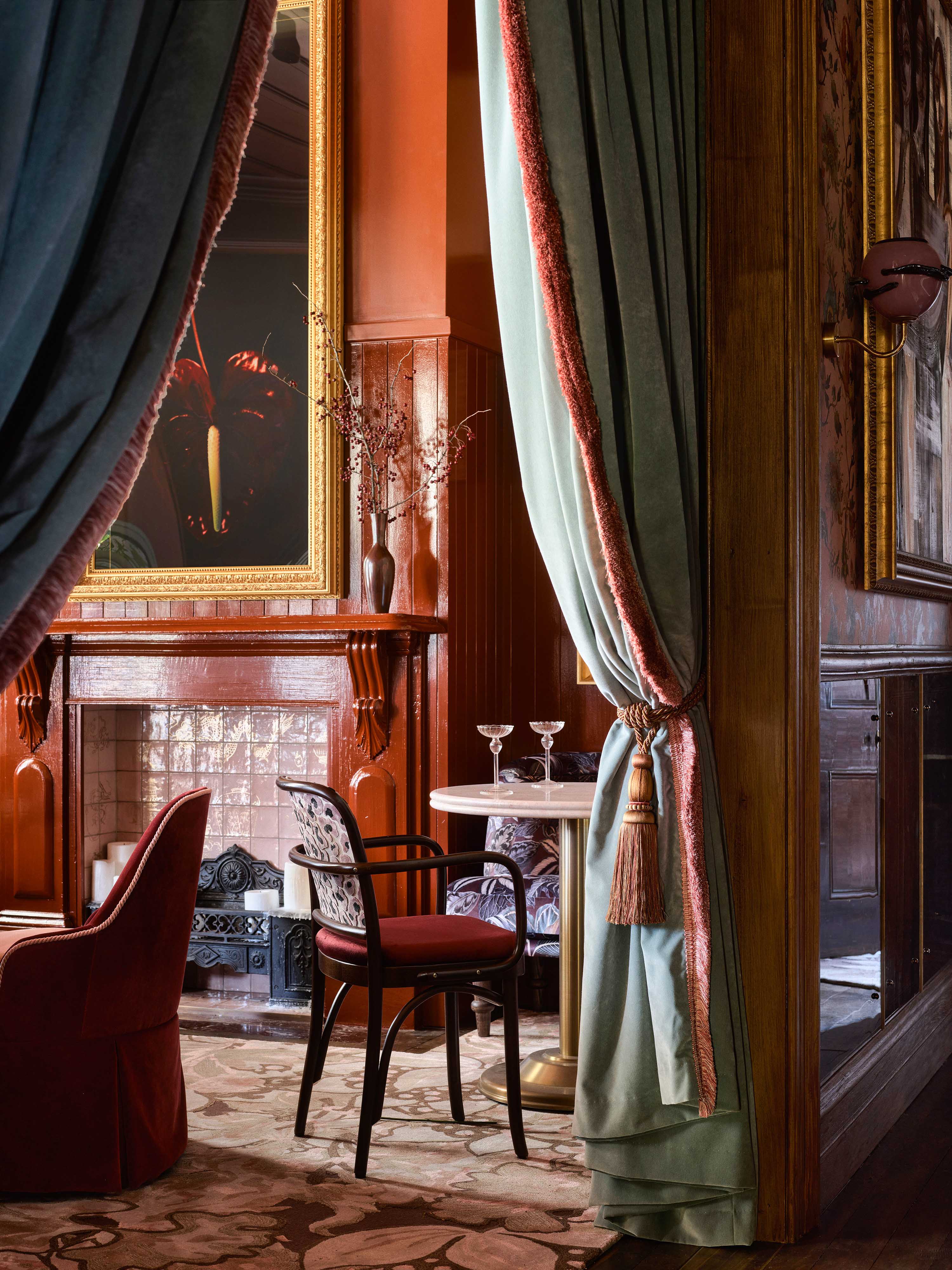
Ayrburn’s story dates back to the 1860s, when William Patterson arrived from Scotland and named it after his hometown of Ayr and the Scots word “burn”, meaning “creek”. He worked hard, building the original stone farm buildings and a tiny cottage – now The Burr Bar – squeezing 11 people into the cramped quarters. By the 1890s, as the farm prospered, Patterson constructed this homestead. He was a pioneer, and that same innovative spirit has underpinned the entire Ayrburn project. The precinct honours its heritage – and Billy’s is its conceptual crown jewel. SA Studio’s Jessie Sutherland tells us how she used Dulux Colours of New Zealand range in a rich interior inspired by the house’s history.
“The project was a collaboration between SA Studio, Alexandra Watts at Winton, and Alexander & Co. We wanted to reference how the original family lived in the homestead, while weaving in new stories, so each room carries its own identity. More is more, layers add drama, and you feel as if you’ve been transplanted into somewhere else entirely.
“The entry is pure theatre – a lush, gold-curtained hall branching into five dining spaces. The front room, once occupied by aunts and sisters, plays with floral wallpapers and rich fabrics, contrasting with the burnished russet of Dulux Waverley, while the northeast sunroom lifts into lighter tones (Dulux Rai Valley and Dulux Muriwai Half) with delicate leaves scattered across the ceiling.
“In the darkest southern room, we embraced depth using rich blues. This space likely served as Patterson’s evening retreat – whisky in hand, fire lit – so we shaped a contemplative atmosphere through paint, art and layered accents. We played with gloss too, painting layer upon layer to combat the 150-year-old home’s crooked walls and inconsistent undertones. Much of the paint was brushed rather than rolled, so the depth of traditional application shows up close.
“The exterior was equally important. The building had been plastered over in the 1950s, so we stripped it back to reveal original timber weatherboards, then worked closely with Dulux to scan and match the historic paint to modern equivalents. The old roof – faded under layers of snow and rain – was removed, a new waterproof roof constructed underneath, and the original aged corrugate reinstalled over the top. Where sheets were missing, recycled iron was hand-painted by a film-set designer to match.
“The project team did immense work pulling it all together, sampling wallpapers, colours and swatches to achieve compatibility across contrast, scale and theme. A key design decision was to make the bar the restaurant’s core. Every room breaks from it, picking up a tone to keep the palette within the same family.
“I felt an immense responsibility to get it right and honour the past, the people and the buildings. They’ve had their story over the last 150 years, and we’re uncovering a new one that recognises that, while writing the next chapter.”
Dulux Colours of New Zealand
Related Stories: