Lynda Simmons likes to joke that she’s the slowest architect in New Zealand. She works part-time as a lecturer at the University of Auckland’s architecture school, and only takes on one or two projects a year. It’s a completely non-commercial approach born out of a frustration with taking on work she didn’t like, just to pay the bills. When clients approach her, the first thing she does is explain that the process won’t be quick, but it will be thoughtful. If that’s a deal-breaker, she has a lot of friends she can recommend. “My whole approach to architecture is slow and small,” she says. “I design them as small as I can get them, and I also work very slowly.”
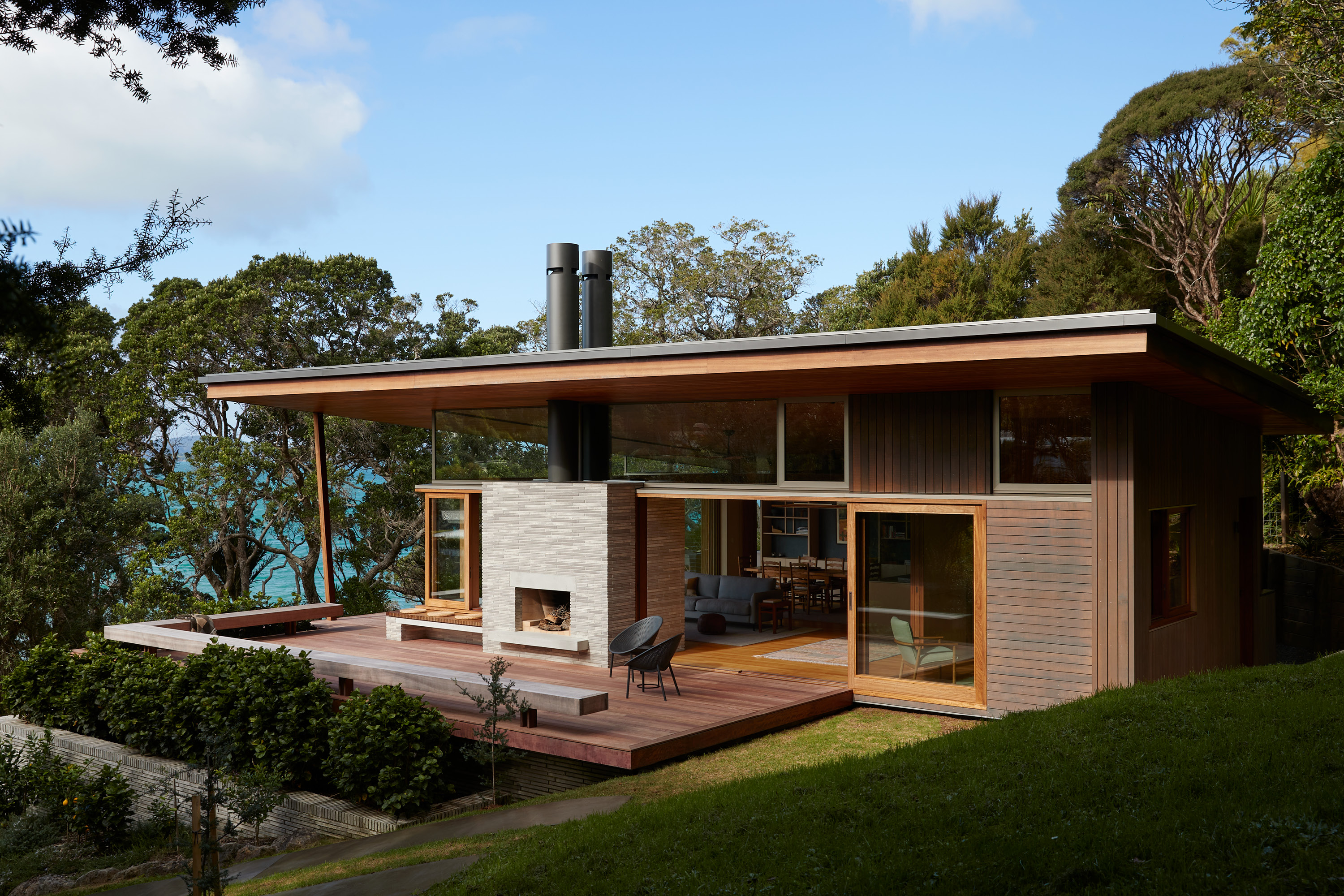
In the case of this project on a sloping site overlooking natural bush near Onetangi on Waiheke Island, the whole process took four years, including 12 months on site. Which isn’t so long, I say. “Yes, but it’s a tiny project,” she says. The clients, Marty and Tammy Williams, are cinematographers. They built a very lovely house here a decade and a bit ago to a design by Te Whanganui-a-Tara Wellington architect David Melling. It’s located on a long, sinewy road that is not quite suburban and not quite rural; it’s close to the beach but has views to the west over a bushy valley. The house runs east to west. It’s long and thin, with a very strong language of timber portals that step down the site. Their son is now a teenager, and they have family who like to visit, but with only two bedrooms, they needed more room.
They approached Lynda – undaunted by the speed at which she works – after seeing work she did for Tammy’s mother. “She did a lovely job and we were like, this is beautiful,” says Marty. At that point, their thinking was to add a two-storeyed volume at the top of the property, connected to the original house, to create extra living space and a new primary bedroom, while preserving an existing golden tōtara and their parking space.
Lynda designed it, and then they met again. “They gave me their functional brief and I did the functional design,” she says, “and then we all sat there at the first meeting nodding, saying, ‘Yes, yes.’ And then someone said something like, ‘It’s not very good though, is it?’”
So she proposed something a little more radical: pulling the new structures away, and scattering them around the tree – a set of pavilions separate to the original house, to contain a new bedroom, bathroom and living space. “Which gives you this pool of light between the two,” she says, “and we can look back towards the house from a place of shadow.”
She sketched a new plan pivoting around the tree, incorporating an L-shaped pavilion close to the house containing a bedroom and bathroom, and a second living space that doubles as a room for games, watching TV and craft. It was to be deliberately dark.
“Tammy and I both bend towards the darkness,” says Marty. “I’ve always liked dark spaces and environments and hotels and bars. I hate houses with bright downlights – we wanted to be enclosed in a space that feels moody.” At that meeting, they started pulling out pictures of Japanese architecture. “Marty started talking about this idea of looking from the dark into the light. I’ve never had a client raise that in my 40 years of working,” says Lynda. “Not one. They always talk about the light coming in – they never talk about sitting in darkness, working towards light.”
As you might have noticed, Lynda also has a thing for shadow. There are three types, she reckons. There’s cast shadow, which is when the shadow falls behind something, creating a two-dimensional mark on a surface. Then there’s modulated shadow, which is when a shadow falls across a landscape or maybe a face – a softer focus. And then there’s contained shadow, which is when a room or a building holds shadow, and you look out of a defined shape at the light. “It’s a made-up term. It’s when you’re looking at a very strong definition, a three-dimensional darkness being held. And it only works if it’s flooded in light from somewhere – otherwise it’s just a grey murky void.”
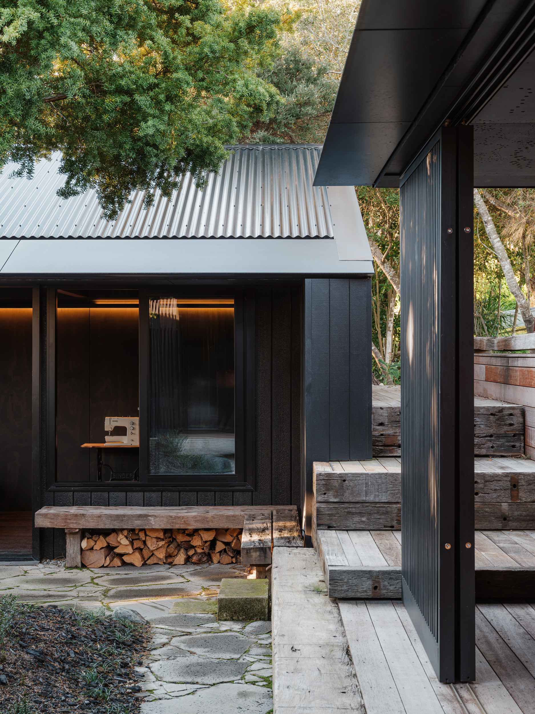
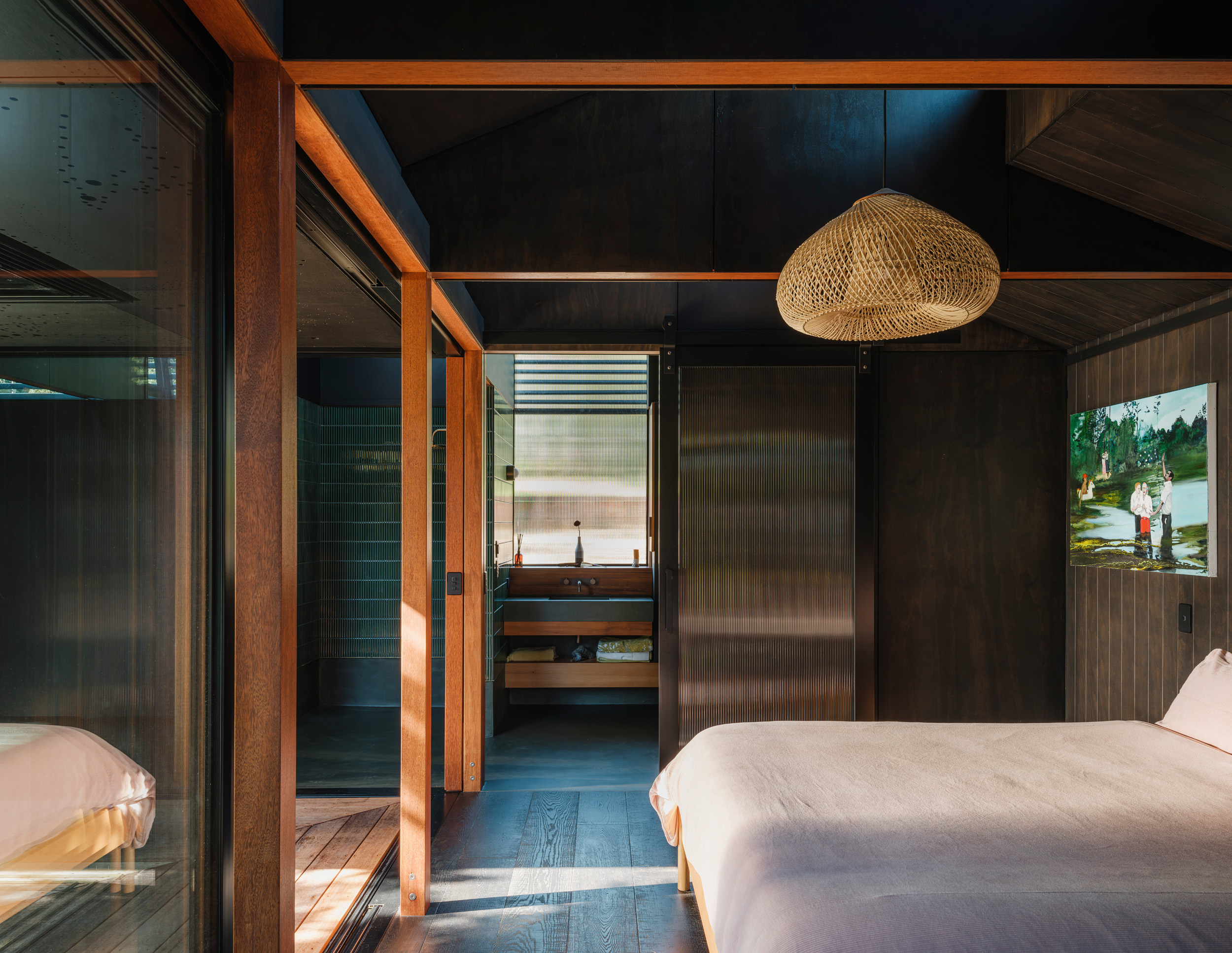
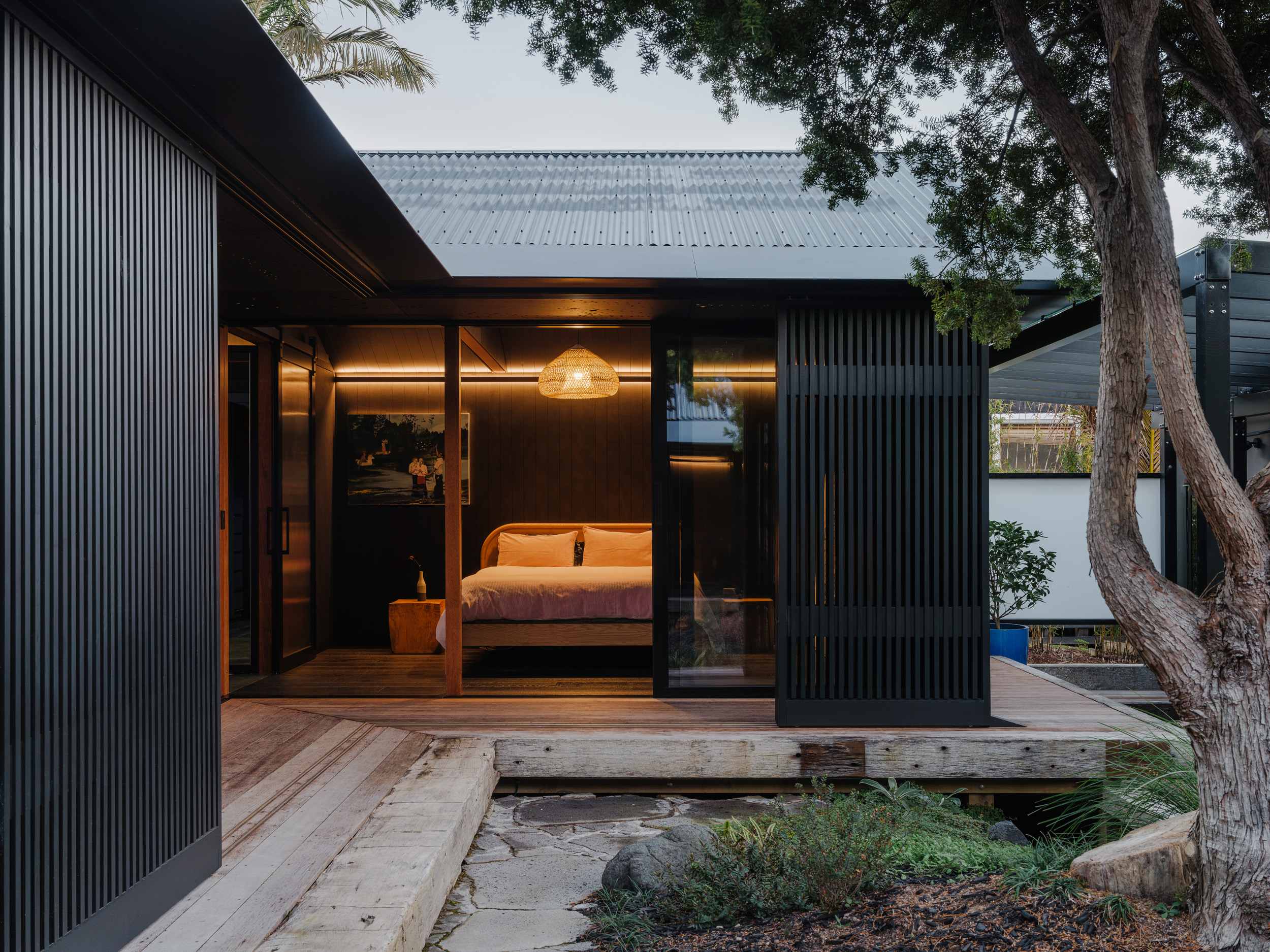
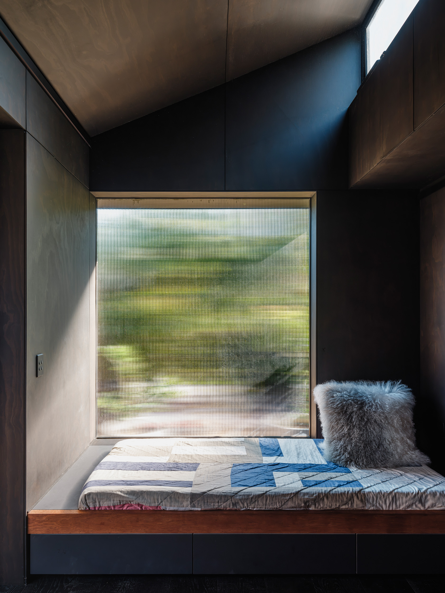
Lynda has another term for the bits that are lit up: the illuminated plane. “If you’re in that room, it’s not actually that dark,” she says of the new second living space. “It just looks dark. You have to be looking out at light to appreciate it – so there has to be an illuminated plane, for the contained shadow to work.” In this case, the illuminated plane is the courtyard, and the roof of the building, which is black, but reflects the sunlight.
Lynda handed over to Sayes Jackson Architects to take the place through building consent. The Tāmaki Makaurau Auckland firm specialises in both its own work and documenting the work of other architects. Lynda has learned over the years to pass the consenting work over, enabling her to focus on design. She picked the project up again in time to design cabinetry, bathrooms and oversee the build.
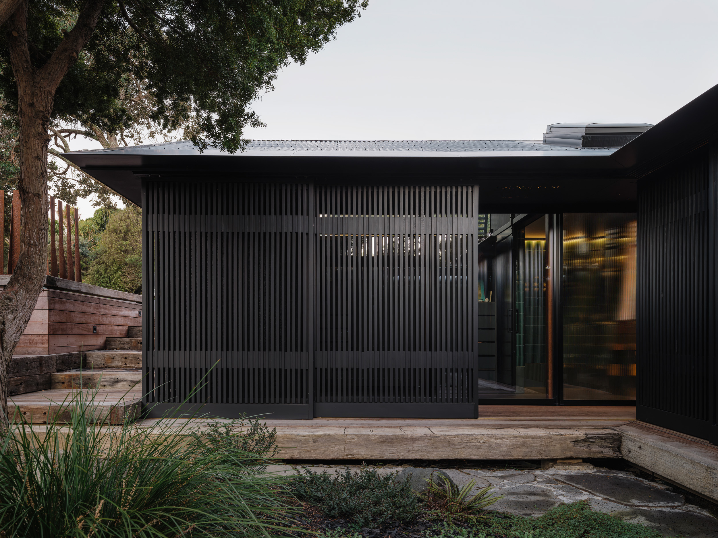
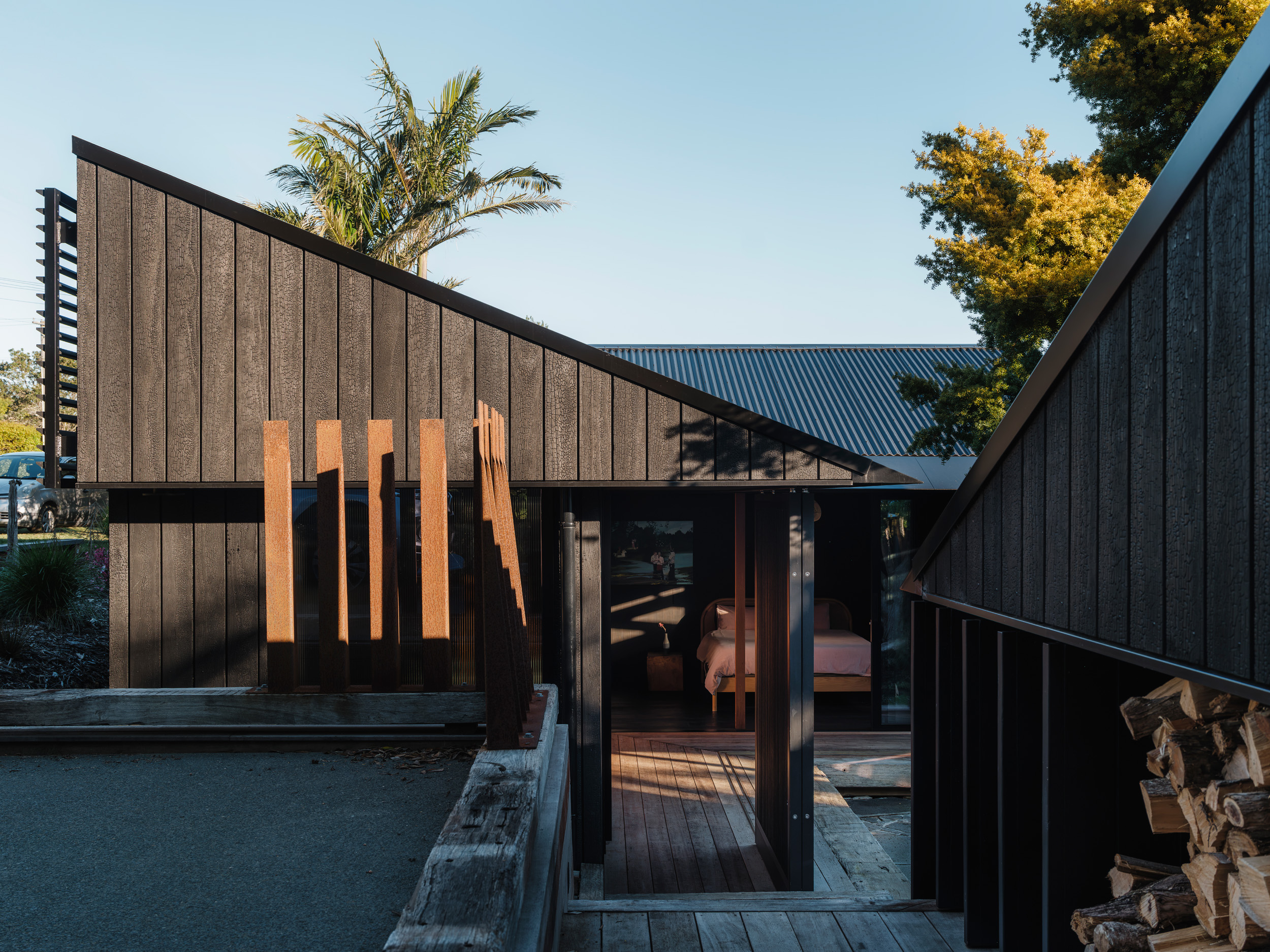
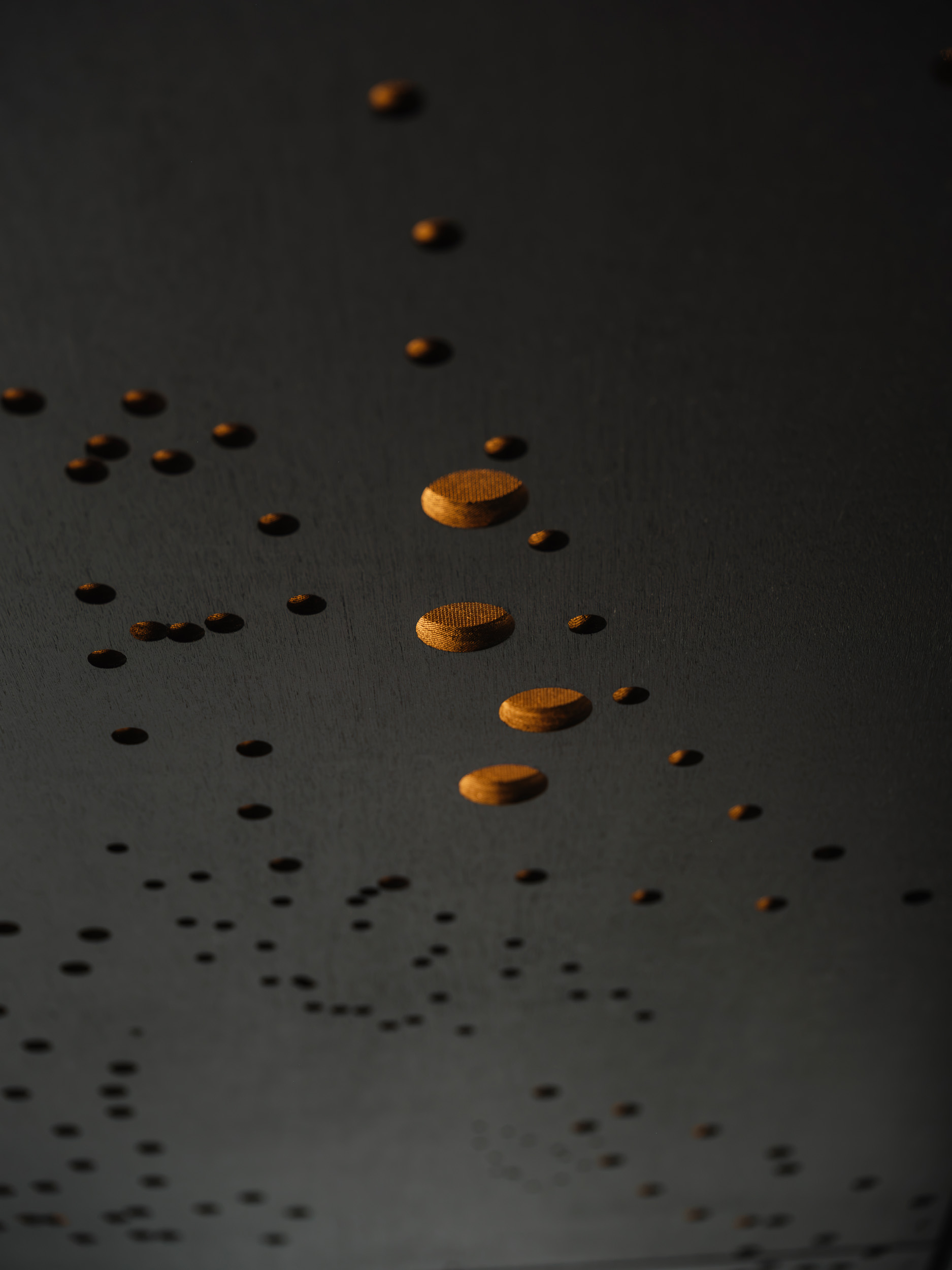
Now, when you approach the place from the road, you park in the same spot as you always did, but in between the house and the road are two little black monopitch pavilions. They have yakisugi – charred timber – on the outside, and they’re stained black on the inside. They’re devastatingly simple in the way they’re designed, and that feeds into the whole idea. Lynda used standard triangular trusses at a 1.2m interval, supported by a line of posts just inside the line of the doors, which pull right back. The structure allows the verandah to be unencumbered by posts, which gives it a delightful sharpness at the bleeding edge, a detail Sayes Jackson laboured over. Inside, the trusses are lined with ply and capped with a piece of stained timber: it’s a mid-century detail, suggested by the firm, and it adds to the elegantly functional language of dark timber post and beam.
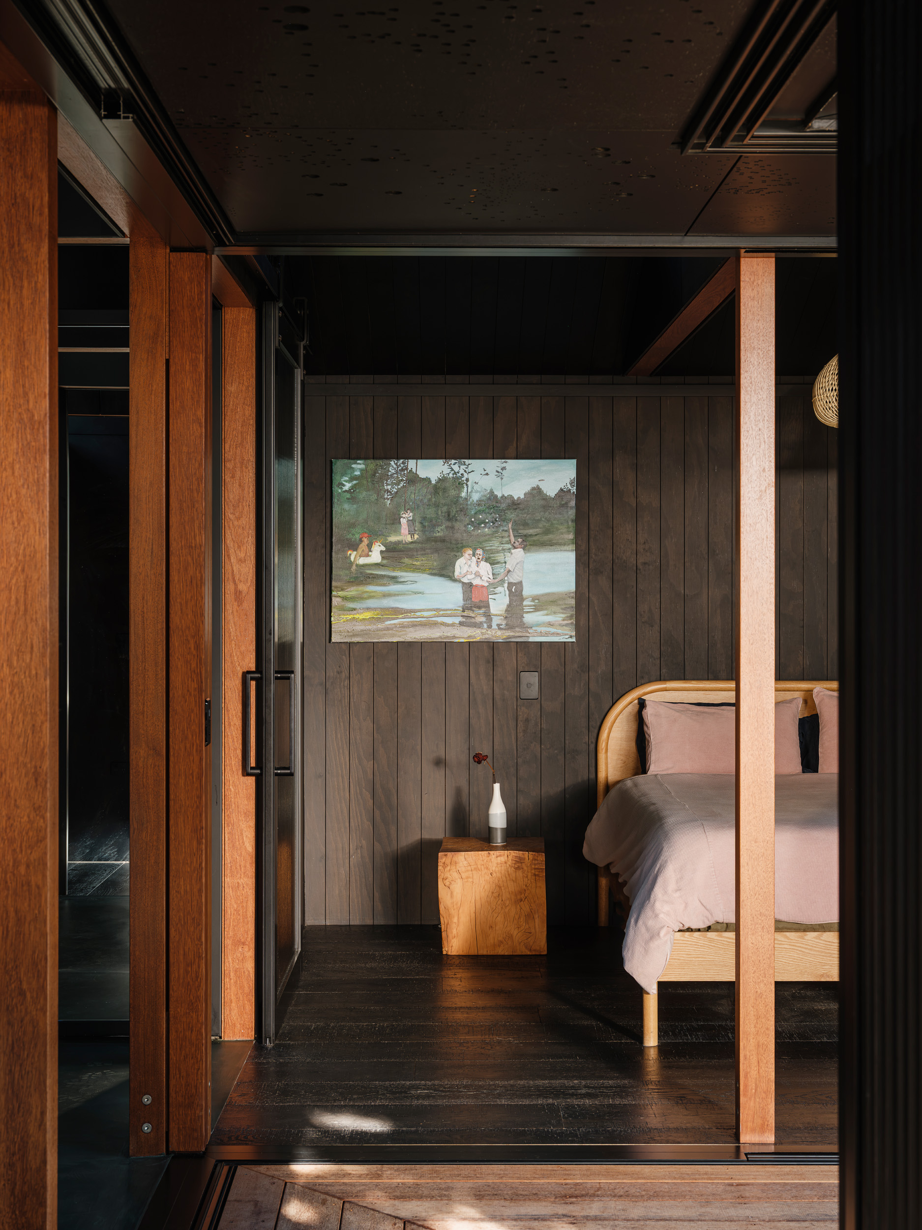
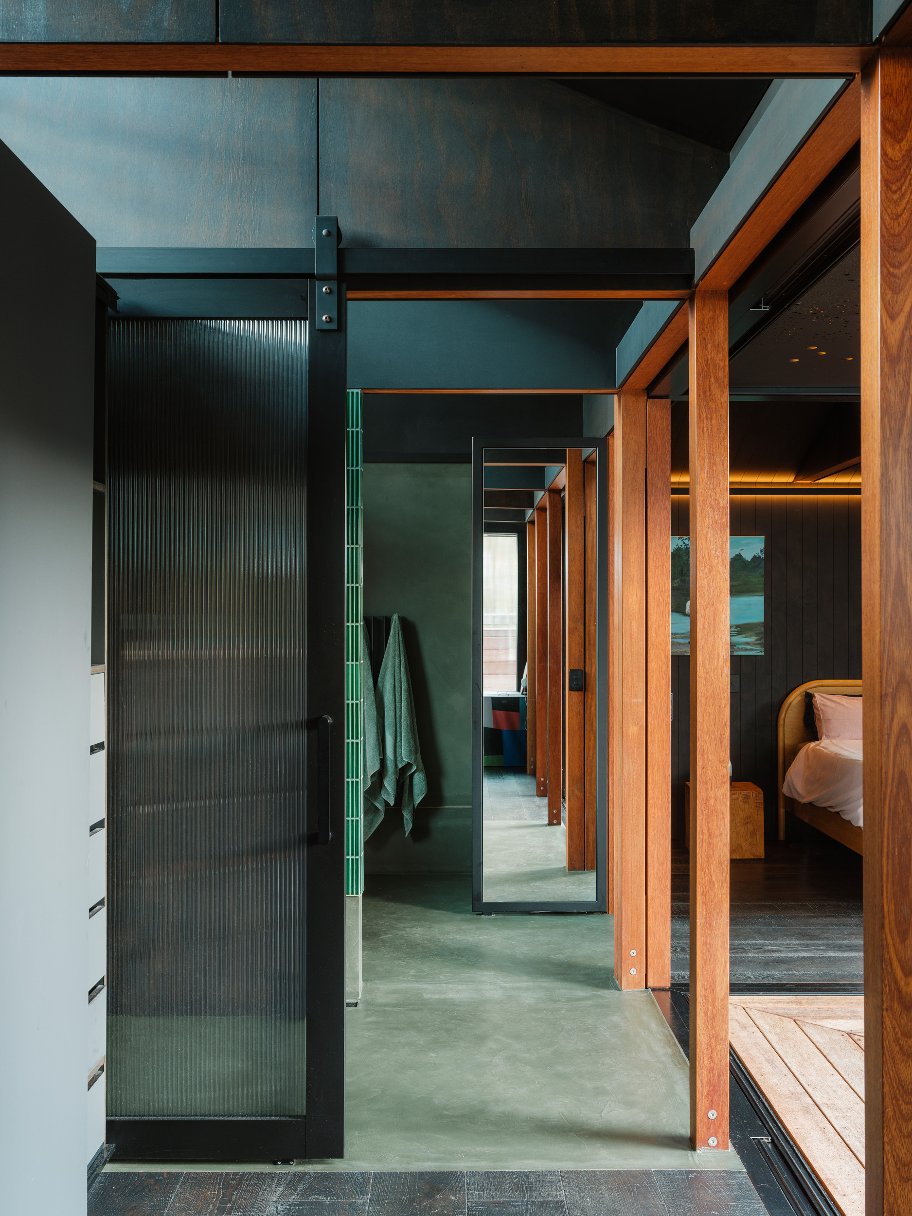
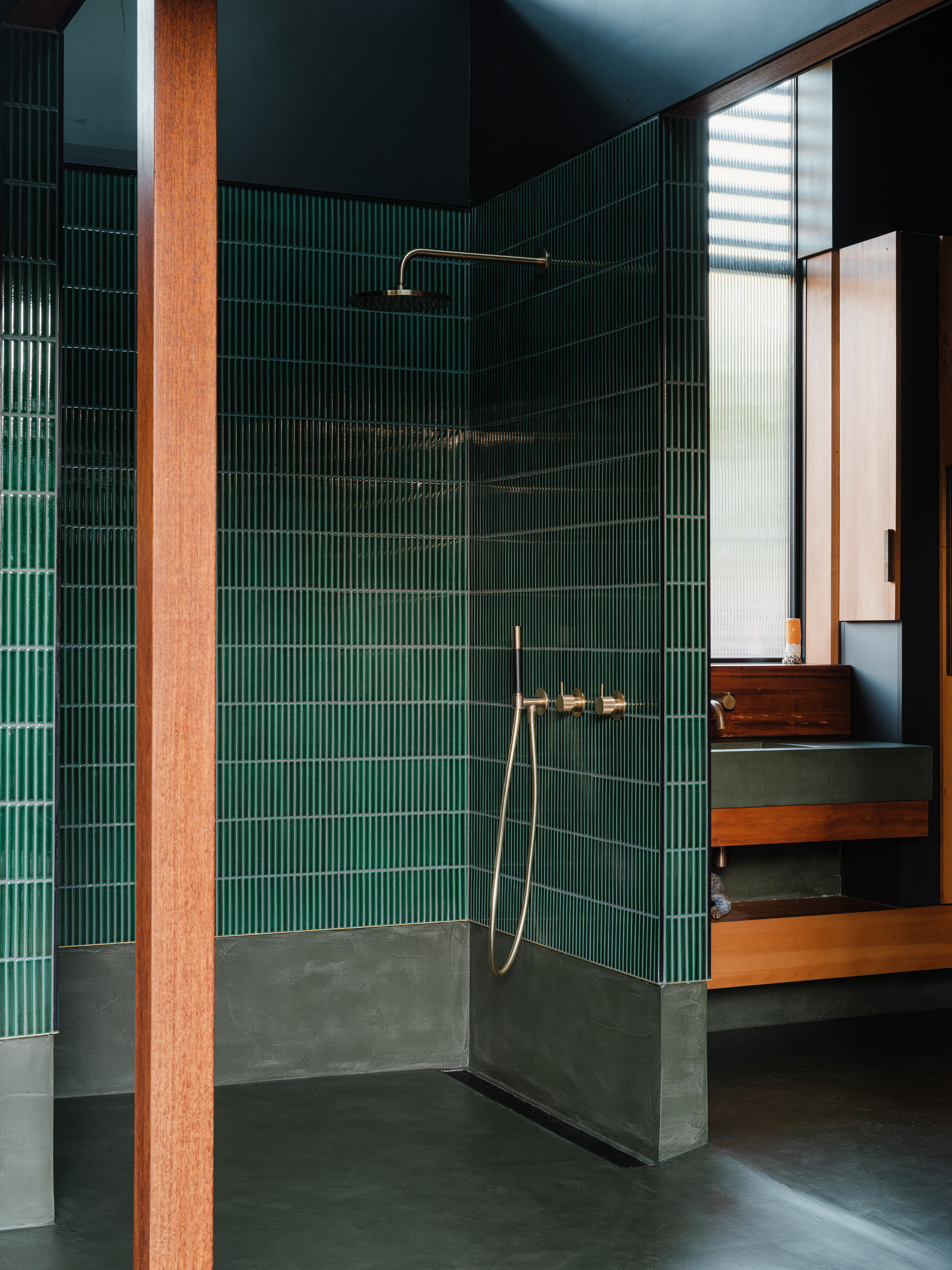
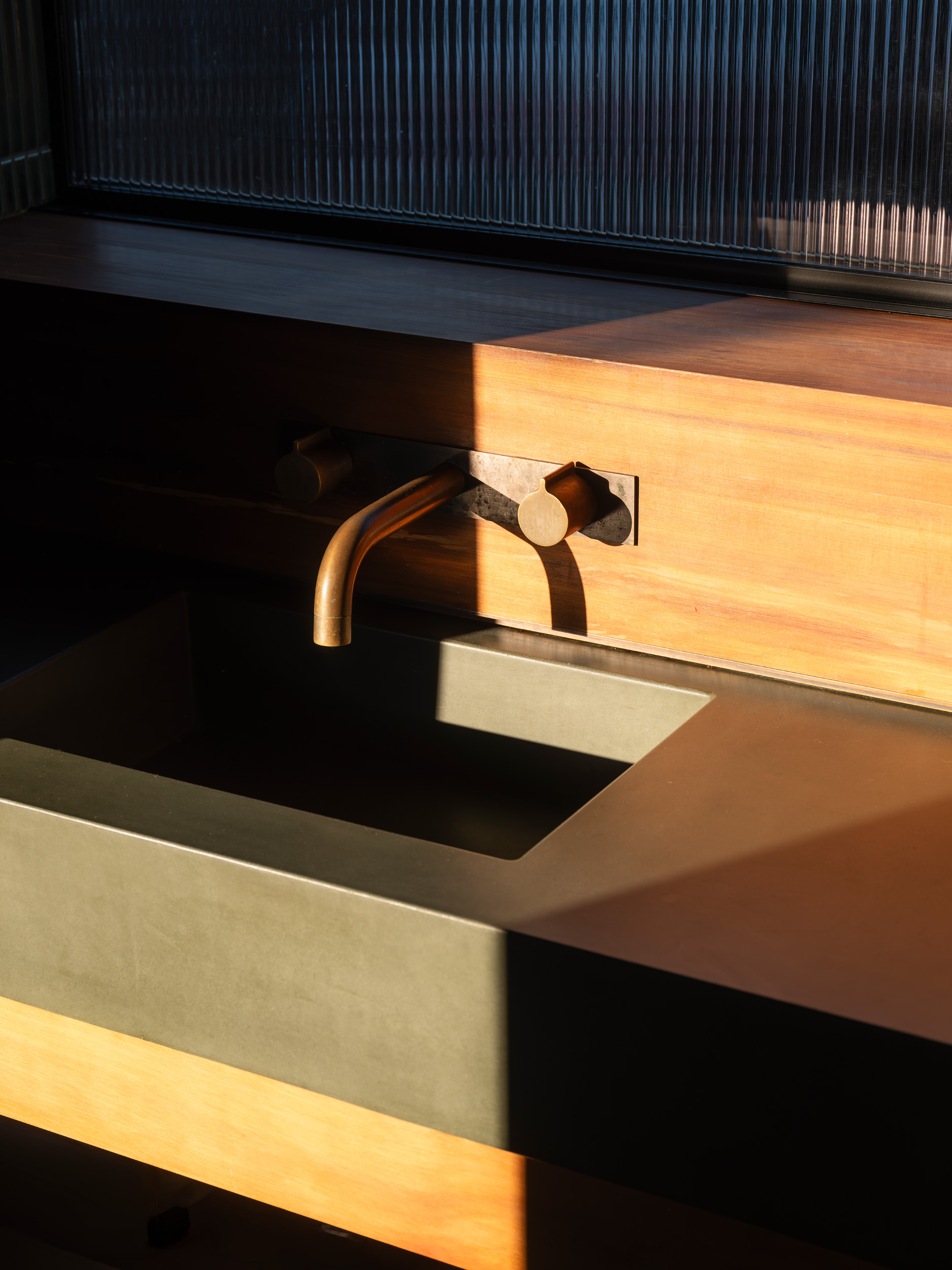
Internally, the rooms aren’t big, but they feel generous. The walls are dark-stained ply, but the bathroom is green – a nod to the green courtyard outside. Architects and owners agreed on almost everything, except the timber posts: Lynda meant for them to be stained black, but the clients fell in love with the raw timber. There are multiple layers between inside and out: a line of sliding timber screens, painted black, the verandah, glass sliders. At night, it looks like a lantern; by day, the contrast between shadow and light is exactly as the clients and architect intended.
“Their aesthetic is really strong,” says Lynda. “If I missed anything, they’d tell me straight away.” At one point, she showed them a product she thought might work for some screening. “They took one look at it and said, ‘It’s shiny,’” she says. “They didn’t want the reflection – they wanted it dull and matt. It’s good when people are that clear.”
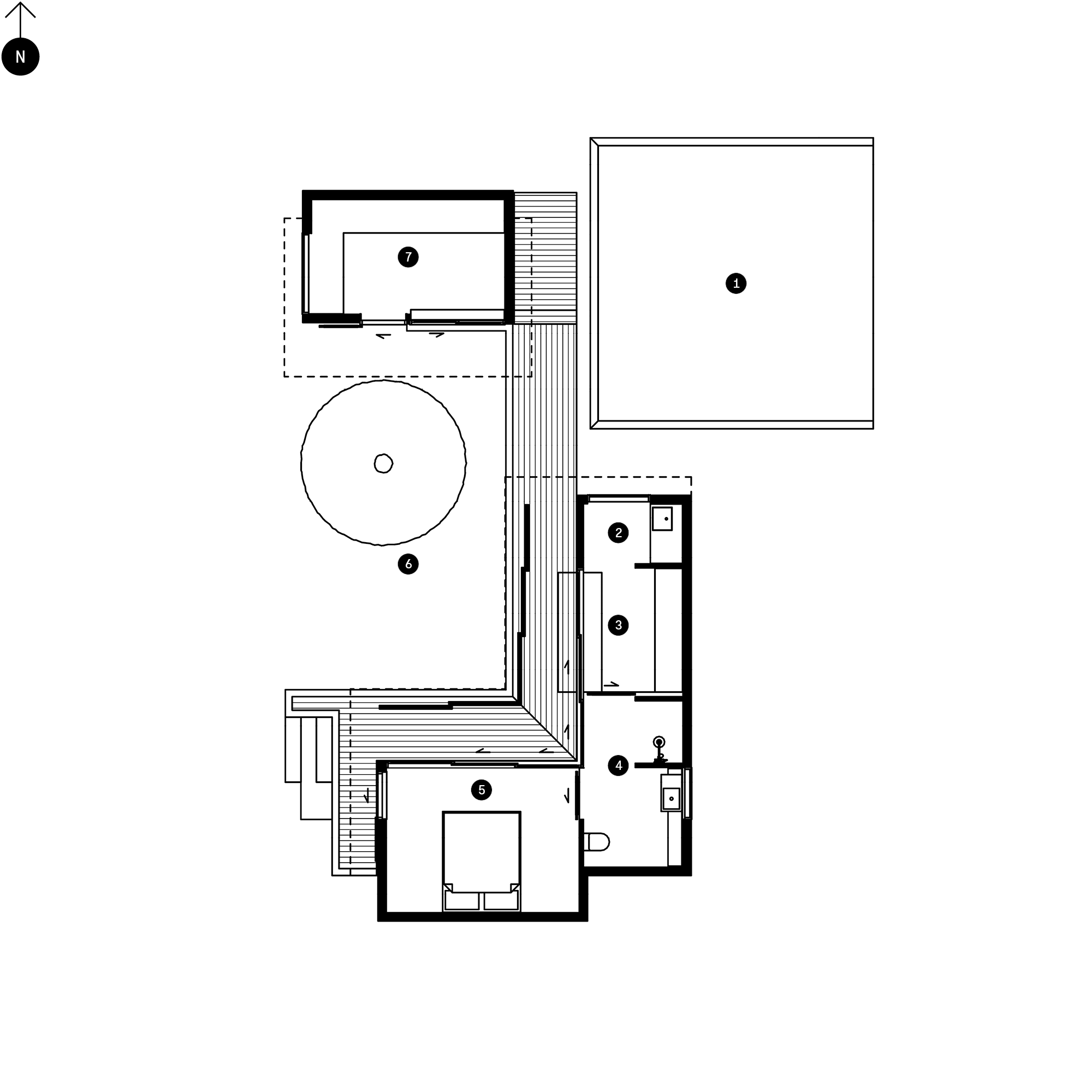
1. Parking Bay
2. Laundry
3. Wardrobe
4. Bathroom
5. Bedroom
6. Courtyard
7. Games Room