We can all attest to the power of colour to transform spaces, but treating colour as a driver for the design – rather than just applying it to the surface – gives spaces identity, meaning and comfort.
For 39 years, the Dulux Colour Awards have celebrated the best use of colour in architecture and interior design, and this year’s winners are an exceptional crop. “Our aim with the Dulux Colour Awards is to reveal and reward the ultimate exemplars of architectural innovation using Dulux colour as a central design device,” says Dulux colour specialist Davina Harper, “therefore highlighting its unique potential to transform our built environment.”
The awards honour projects across residential, commercial and public categories from Australia and New Zealand, and also name two student winners each year. From more than 400 entries, the jury of six architects and designers – including New Zealander Alex McLeod, of at.space – picked 89 finalists and a handful of winners.
The repeated use of a singular colour is a noticeable pattern. While seemingly straightforward, such restraint requires courage, understanding and precision. Rule-breaking and genre-defying use of colour also featured frequently, including the use of contemporary hues on heritage buildings to manipulate spatial relationships and reimagine historic features. Colour is also being used to soften traditionally hard buildings, blurring the boundaries between residential and public architecture.
New Zealand Grand Prix: Lava Flow by Pac Studio
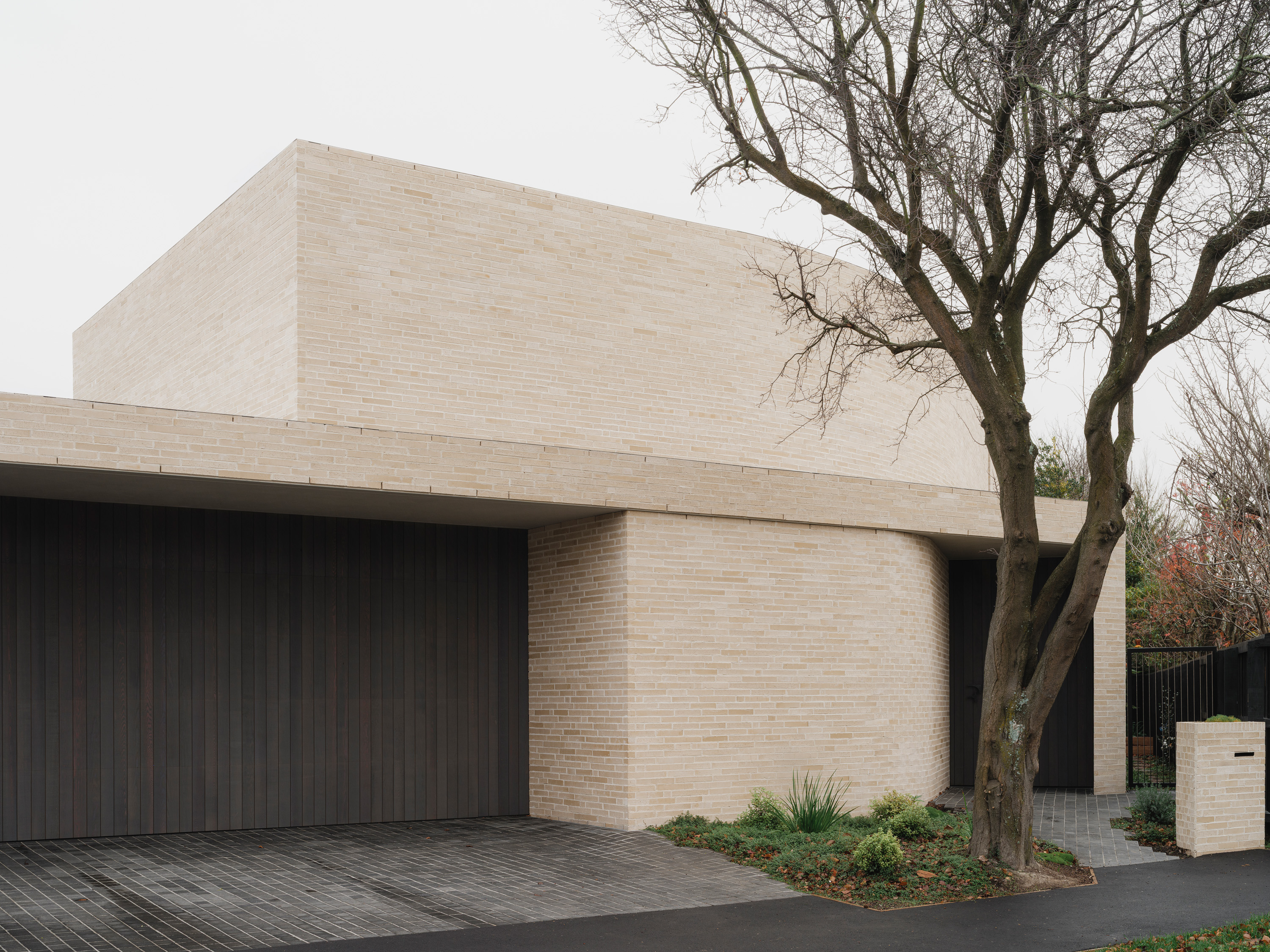
The alteration and extension to a 1900s villa in Mount Albert, Tāmaki Makaurau – which features on p.78 of this magazine – displays remarkable chromatic restraint, spatial understanding and precise execution. Dulux Silo Park is the hero here, referencing the volcanic lava flow that drove the form and colour of the project. “Their commitment to the strategy exemplifies the power of a single colour to determine and define a built work,” the judges said.
Australian Grand Prix: Sarah & Sebastian Armadale by Richards Stanisich
Graphic power and uncompromising use of colour drive this project, an ornate space for a contemporary jeweller in Sydney. “The commitment to a singular colour, specifically Dulux Delta Break green, is courageous and surprising, especially in an upmarket shopping strip that errs on the conservative side. Its execution sees the juxtaposition of this vibrant hue with reflective materials and rich organic textures, offset by soft mood-lighting, to elicit an ethereal effect reminiscent of the shimmering ocean and its giant kelp forests.”
New Zealand Student Winner: Pātaka Kōrero / Fale o Tala, A Storehouse of Narratives in Samoa by Will Chomchoei
This concept deftly navigates the challenge of uniting four structures across three locations, giving equal consideration to traditional and modern components. Each structure represents one of nature’s elements. “Its soft suite of hues has been purposefully selected to enhance the cultural significance and environmental resilience of the project.”
Residential Interior: Elonera House by Studio Doherty
There’s an ethereal quality to this house, a weightlessness and a translucency that creates a welcoming contemporary sanctuary from heritage beginnings. “The overall composition is delicately balanced but when dissected, reveal some unlikely participants,”said the judges. Take the use of Dulux Calandre as the dominant hue – in combination with brushstrokes of other colours – nine in all. “Elonera House has been exquisitely composed, with pitch-perfect tone, rhythm and dynamics.”
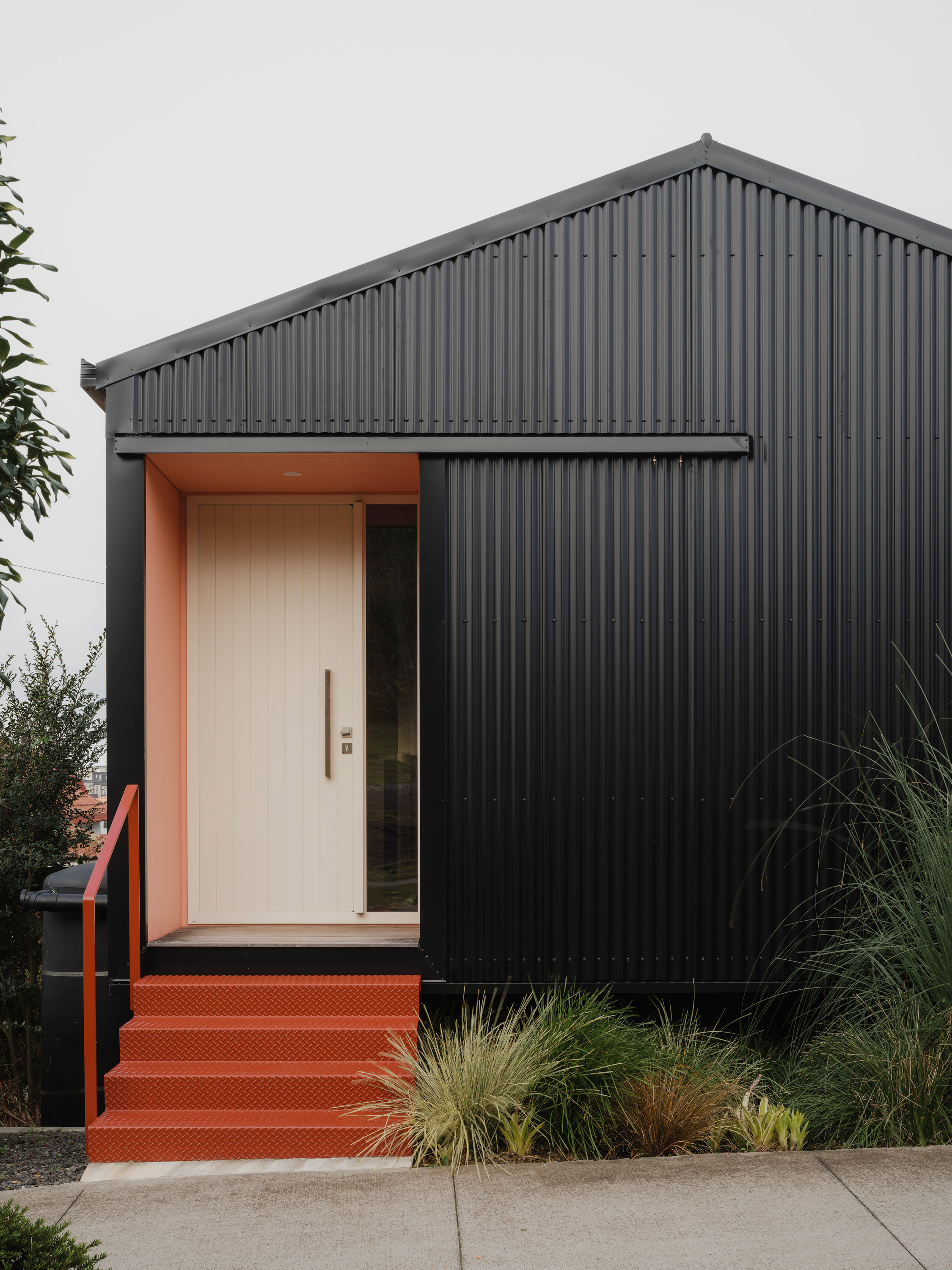
Single Residential Exterior Winner Dunstan by SSdH
In a post-war housing estate of modest brick homes, this project surprises and delights with its strikingly understated use of colour: Dulux Yellow Varnish paint on the pergola elevates the structure from functional to personality-driven. Said the judges: “Although a bleached yellow, its freshness is equally relevant as a contemporary stamp and a heritage nod, driving a unanimous vote for this award winner.”
Commercial and Multi-Residential Exterior: Northern Memorial Park Depot by Searle x Waldron Architecture
This operations hub redefines the depot typology in numerous ways, and the use of graduated greens across its perforated-steel exterior plays a key role. “It is a beautiful example of the potential for industrial programs to be both functional and empathetic, and the judges commend the sensitivity with which this project has been designed for those working in emotionally challenging contexts.”
Commercial Interior – Public and Hospitality: Melbourne Place by Kennedy Nolan
After staying there recently, we can attest that thecelebrated Melburnian practice’s design for an inner-city hotel is bothimmersive and welcoming, and that comes down to colour. “It is intriguing, unpredictable, theatrical butcontrolled,” said the judges. “There is a pervasive earthiness to the paletteof layered textures and hues, beautifully united as a whole, yet employed sodistinctly to each entity that they bear their own unique identities.”
Temporary or Installation Design: Carol Jerrems: Portraits by Youssofzay Hart
Clear, simple and elegant, this exhibition featured complex and layered visual links between 140 silver gelatin photographs and the spaces they occupy. Powder-coated blue steel poles contrast with rust-orange hue on display boards. “It illustrates the designer’s clarity of thought and understanding of the use of recessive and dominant colours,” noted the judges.
Dulux Colour Awards

Related Stories: