Our old house was painted white – outside and in – with touches of colour and an extension clad in fibre-cement sheet. Our architect tried to convince us to paint the weatherboards on the rest of it a kind of smoky grey and in hindsight, I think she was right. (Sorry Megan.)
Partly, it was a reaction to the old house, which, when we bought it, was tired and cream on the inside, and tired and greige on the outside. The first thing we did was paint it white. It felt cleansing, and I never really got past the sense of needing to obliterate its flaws, even when we’d rebuilt the thing so there was almost nothing left to recognise of the original house.
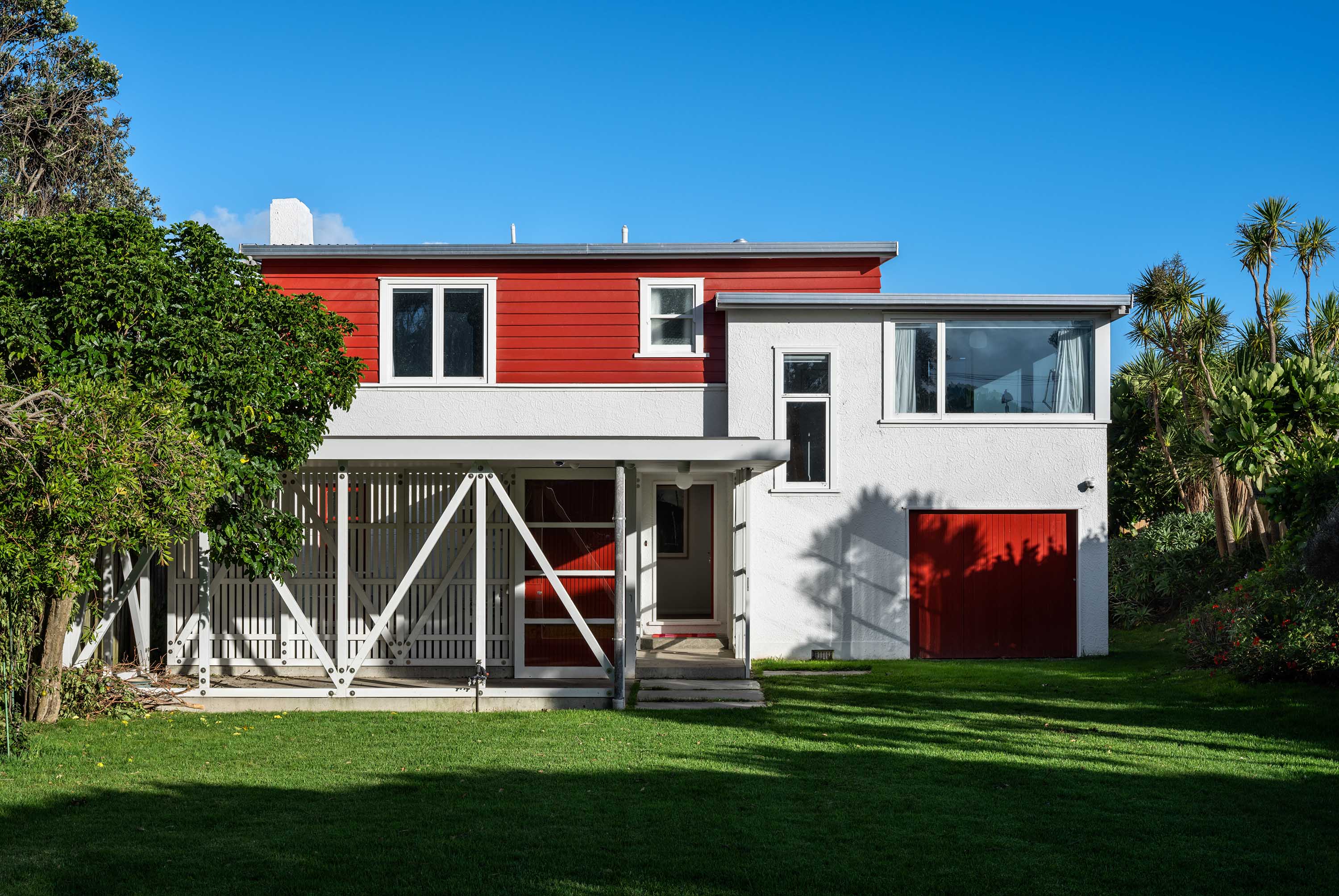
When we moved here, it was just after lockdown 2020. As I might have told you once or twice, this house was possibly in worse condition than our previous one (mould, rugby posters, broken barbecues), and yet, we didn’t instinctively get out the white paint.
Partly, it was a reaction to the approximately 423 open homes we’d been to in the struggle to buy it. (Ira: Yes Dad, I know you tried to buy that house, you tried to buy all of them.) Every house felt staged with the same white colour scheme; every house smelled like fresh paint.
More particularly, I think it came from a deep need – for security and warmth, for texture and softness. We didn’t feel the need to live in a white box when the world was going to pot. Still don’t.
So instead, we opted for a murky set of in-betweens – greys and beiges and charcoals: the dark rooms are painted very dark and the kids’ rooms are, respectively, a murky green and mustard. It shouldn’t work but it does – and it’s amazing for art and furniture.
It has its challenges: you have to work harder at what goes next to what, since there is an active participant on the walls. We’ve repainted a couple of rooms more than once, because we definitely got it wrong more than once. But when you get it right? It’s sensational.
When we started Here we told you the magazine would be dedicated to colour, joy and fun – and we’ve done that since issue one, though this is the first issue dedicated to houses that commit so wholeheartedly to colour. (And yes, it does include a house which plays on black and white.)
Funnily enough, I didn’t set out to do that – the houses came together organically. But this winter feels like the end – or at least I hope it’s the end – of three years of crisis: a pandemic, a supply crisis, a recession, floods, and people feel a little frazzled. I don’t mean that colour will fix those systemic issues, but if you’re looking to make yourself feel a little better, then I know just the trick.
Related Stories: