The old adage, ‘Patience is a virtue’, is tossed around with painful frequency in real estate, often to soften the blow of another rejected home offer or unsuccessful auction bid. But as the creative couple behind this riverside Ōtautahi home proves, it still holds a modicum of truth.
When they began their house hunt many years ago, their wishlist was somewhat specific. First and foremost, they wanted a building with mid-century character, ideally with notes of Christchurch modernism. It needed to be in the central city, with enough space to house a two-bedroom apartment, office, studio and workshop. They didn’t mind taking on a project; in fact they rather expected one.
Right from the beginning, they were up against it. Any character buildings that the Canterbury earthquakes hadn’t claimed were too small, happily owned or tenanted. “We had been captivated by the exterior of the Oxford Terrace building during our searches and were disappointed to find out that it came on the market and sold while we were overseas,” says one of the owners. They kept one eye on the building and resumed their search. Then, three years later it came up for lease and they convinced the owner to sell. Finally, it was theirs.
It was a commercial building — a vast, open-plan space on the top floor with offices below. Purpose-built by architecture firm Trengrove and Blunt (now Totem Studio Architects) in the late 1970s to serve as their office, it had barely changed in the years since. Looking for an architect to undertake the project, the owners contacted John McGrail, then with Dalman Architects, and asked if he knew the building. “I told them I probably knew it too well because it was where I started my architecture career,” says McGrail. “My first job was with Trengrove and Blunt, so I was able to show them a photo of myself in that building rocking a dodgy mid-80s mullet and matching attire. The photo was going to either win it or lose it for me.” Swayed (or at least not dissuaded) by the vintage snap, the pair engaged Dalman Architects and, working with McGrail and Kirsty Hynd, Dalman’s interior designer, they laid out the brief.
Pragmatically, they wanted a two-bedroom, two-bathroom apartment on the top floor, with a home office, art studio and workshop below. From the outside, however, the building was to look as if untouched. “They appreciated the architecture and style of the building and wanted to be as sympathetic to that as possible,” says McGrail. That meant working within the existing 30-metre by 5.5-metre structure. Therein lay the first challenge. Though the top floor was a beautiful clear space, it was somewhat spoiled by a mass of timber trusses.
Positioned at two-metre intervals, they made the room feel unnecessarily busy and hung so low that the full width of the building couldn’t be utilised. “Perfect when it was an office,” reasons McGrail, “as desks could fit under there, but you couldn’t walk down the wall line, which was where we needed to put a hallway.” The solution lay in raising the entire roof ever so slightly — less than 300mm — to create an entirely useable space within the original external wall line. Replacing the timber trusses with steel portal frames spaced further apart saw the room transformed.


The new apartment pushes the rectangular footprint to its fullest potential. The kitchen, dining and living areas cluster at the front of the house, capitalising on its riverside locale. This sun-drenched central hub is lit by windows that sit high in the gabled roof and wrap the building’s face in an uninterrupted panoramic view. A skylight spine down the roof’s ridge was an idea repurposed from the original build; its design tweaked to eliminate its predecessor’s accompanying leaks.
From here, a long hallway tracks the eastern side of the building to a guest bedroom, bathroom and generous main suite, complete with roof terrace. Though they have sectioned off the once open-plan space, it retains a sense of volume. “Part of the old building’s charm was that on the top floor, you could see from one end right to the other. We wanted to keep that feeling,” says McGrail.
He found the solution by ensuring none of the internal walls reached full height. Instead, they stretch to a common point, then glazing continues to the ceiling. “With no solid walls, you see that original form roll on,” says McGrail. Generous use of reeded glass also allows a level of transparency to the home and conceals one of the apartment’s greatest triumphs — a floor-spanning central light shaft.
Dalman’s design introduced the lightbox in answer to a rather precarious point of the owner’s brief. As an artist whose work is mainly installation-based, she needed a studio to visualise her pieces. A room of white walls that could function as a canvas to hang, rehang, rearrange and reimagine her works. That meant there could be no windows. However, she would also require natural light — a lot of it. “I came up with the idea of punching the hole through as a shaft, basically to drop some light in but also make the physical connection between the studio and the rest of the apartment,” says McGrail. It’s a masterstroke. It sits as a rippled lightbox, softly separating the living space from the sleeping areas. But open the reeded-glass doors, and you step onto a balcony that overlooks the artist-at-work below.
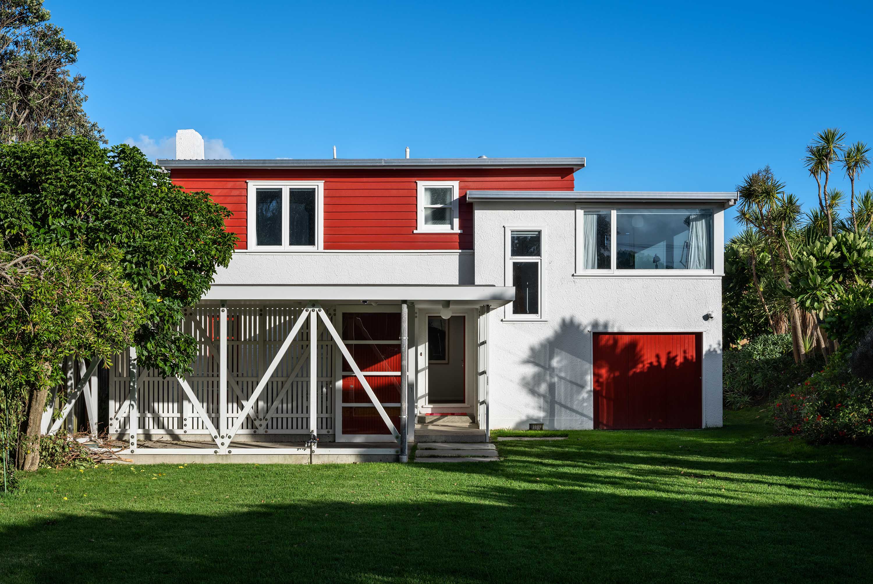
Alongside the studio on the ground floor are the building’s main entrance, the couple’s home office and workshop. A substantial garage also sits at the rear of the building in the project’s only new extension. It offers a secondary entry point and doubles as a base for the main suite terrace. “The building did always have a little garage underneath it,” says McGrail. “That’s where John Trengrove used to squeeze his Rolls-Royce in — while we all watched.”
In a way, the success of this riverside reimagining is down to restraint. Using few materials with precise detailing, the finish is immaculate and considered. An example is the stairwell, where a solid steel plate backs a fracture in the wall’s timber panelling to form a recessed handrail. Thoughtful vignettes like this echo around the building, culminating in a detailed home and workspace that respects its original architecture and ethos. The renovation doesn’t detract from the 1970s style or, worse, try to imitate it. Instead, it’s more of a natural evolution, one that has given the building a new timeline — and a new purpose.


1. Entry
2. Study
3. Laundry
4. Studio
5. Workshop
6. Garage
7. Living
8. Dining
9. Kitchen
10. Light Shaft
11. Bedroom
12. Bathroom
13. Terrace
Related Stories: